MOBILE APP DESIGN
What the Fucculent
TL;DR
The challenge
GIVEN PROJECT CONSTRAINTS:
- Nothing
- No, really
- We were told we could make anything: a website, mobile app, smartwatch app, redesign, new product, you name it, as long as we delivered a completed prototype in 3 weeks.
The challenge before we could even start designing for this project was figuring out what the heck our challenge was supposed to be. How could we identify an actual problem to solve, rather than just go through the motions? My teammates and I spent a while just getting to know each other and for some reason we started to talk about how we had all killed plants. I mean, who hasn't? And isn't it sad when it happens? We decided to pursue this direction for our project with the goal of helping serial plant murderers become acceptably average plant owners by giving them an emotional connection to their plant to motivate care.
My role
Just like for ClimbZen, I volunteered to be project manager. I felt like I had learned a lot from that project and wanted to put those lessons to use. Unlike with ClimbZen, however, I had more confidence in my prototyping skills from working on the USDA Redesign and wanted to contribute more to the wireframes for this project, even though my fellow UXers both preferred prototyping to user research. I also made illustrations for our design assets because I love to doodle.
The solution
Leaning in on user research and competitive analysis helped us tremendously in directing the project. Through those tools, we were able to both define the problem and get ideas for possible solutions.
What the Fucculent takes out the effort and confusion of researching plant care with auto-created care schedules, alerts, plant suggestions, and tool delivery, all with a healthy dose of snarky humor to personify plants and motivate users to care for them.
User Research
Finding our problem space
To give direction to our project scope, we decided to start with a competitor analysis of plant care apps. By seeing if there was a gap in the market, we could narrow down what problem needed solving. It turns out that there are plenty of apps out there to help plant parents (who are already motivated to research plant care on their own) manage care for their multiple plant babies, but what about for total novices who can't even handle one?
Surprisingly, we couldn't find any! Ladies and gentlemen, we have our problem space!
Understanding our users and their needs
So, now that we knew we were designing a plant care app for novices, our next goal was to understand our users' habits, frustrations, and wants around the plant care so we could help better their nurturing experience. To figure this out, we carried out 1:1 interviews with 8 self-reported plant killers. We compiled and organized all our interview notes into an affinity diagram so we could see common threads across the board. We found that:
- users wanted plants around for improving their mood and environment, even if it was likely the plant was going to die.
- users not only didn’t have the time to learn more about plant care, they weren’t willing to.
- plants mostly died from users forgetting about them entirely because it wasn't proactive in asking for water like a pet would.
- users felt like an emotional connection would help them care for a plant.
- many users especially mentioned guilt as an emotional connection.
Guiding our designs
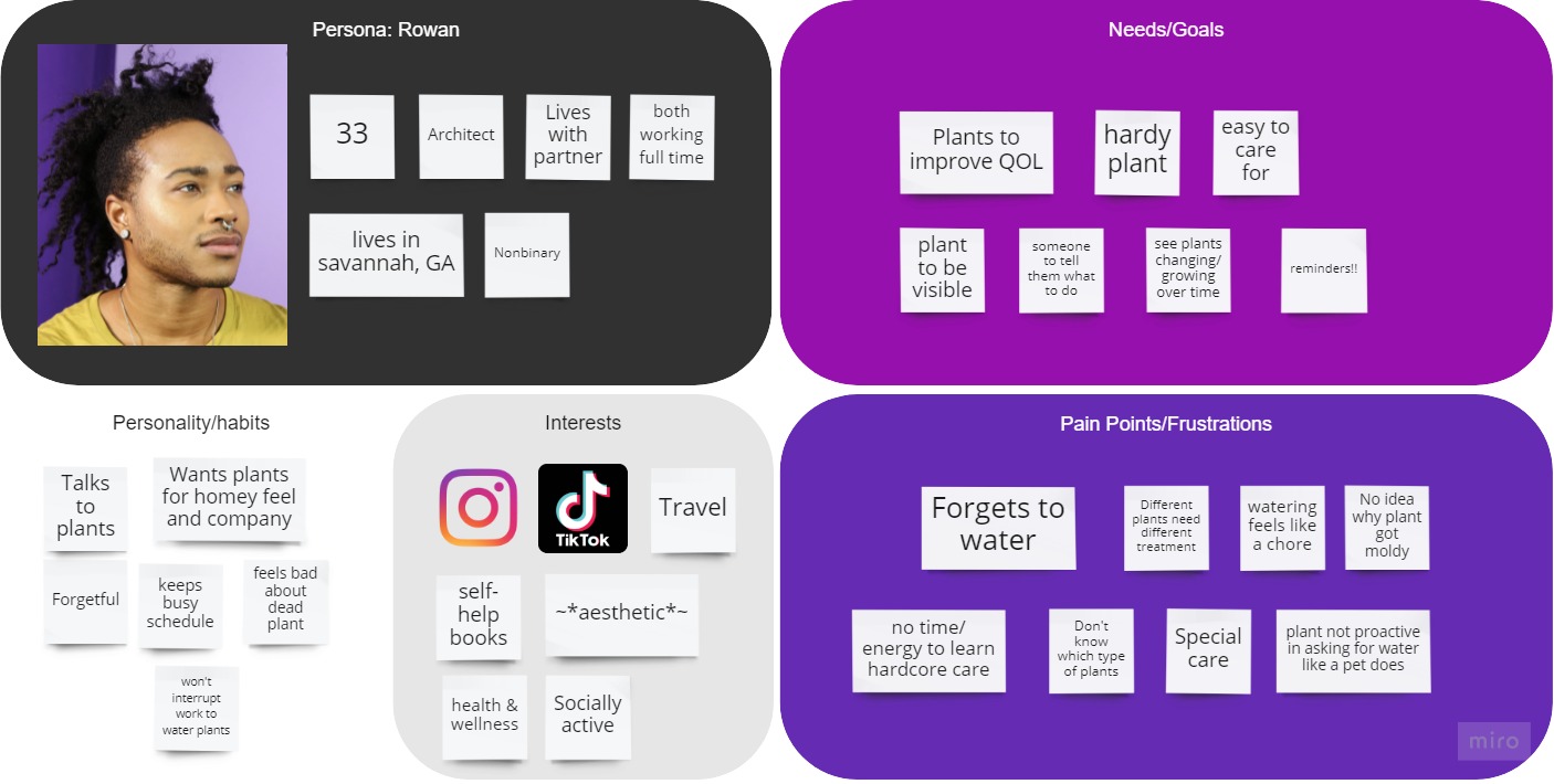
With the findings from our user research, we created Rowan, our user persona, to make sure our consequent designs stayed in line with our research. Rowan has a full-time job keeping them busy so when they come home, they just don’t have the energy for watering or other chores. Sound familiar?
ROWAN'S GOALS:
- Be told exactly what to do to keep their plant alive, and no more
- Low-effort care
- An emotional connection to their plant to motivate them into caring
Ideate
Brainstorming and sketches
Keeping Rowan in mind, our team brainstormed possible solutions to the problem together with both sticky notes and sketches. Since we observed from our research that users tended to kill their plants without structured accountability and direction, we made those the focus of our ideation.
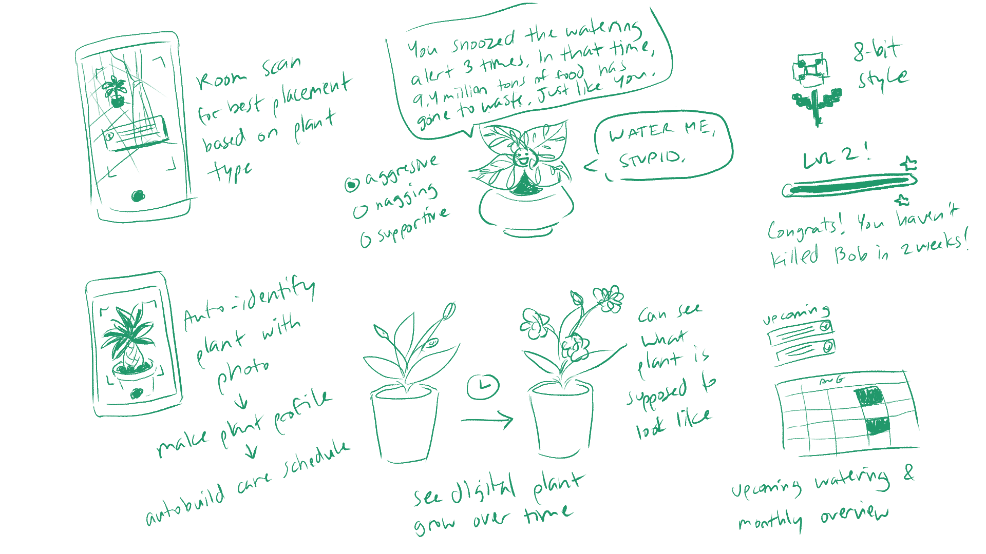
We also looked to indirect competitors to see how they made the emotional connection to users. The thing that stood out to us most was when they personified the app, either positively or negatively. For example:
- Plant Nanny 2's cute digital plant became visibly sad and withered if the user didn't water it.
- Carrot got angry with the user for not completing their to-do list and would switch to progressively ruder speech the longer the to-do list was left unfinished.
Prioritizing
We used a prioritization matrix organized by impact on our users and complexity to narrow down our ideas into an MVP that we could reasonably achieve in the 3-week timeframe.
KEY FEATURES:
- Add a new plant via scan, search, manual entry (if you’re put together enough for that), or suggestions
- Auto-created care schedule and reminders
- Scan a plant to identify it or scan a room to figure out your sunlight situation
- Subscription service for material delivery
- Digital plant levels up over time
- Snark
We also came up with the delightfully irreverent name "What the Fucculent" to clue the user in on the app's personality.
Planning for the prototyping phase
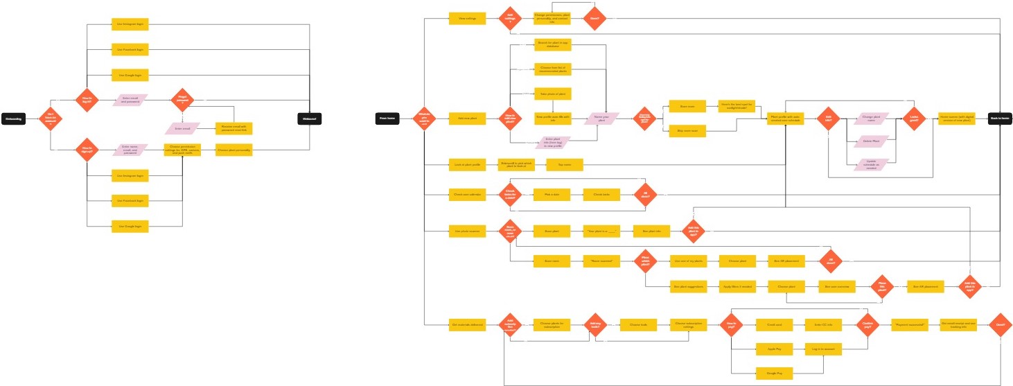
To make the prototyping process run faster and more smoothly, I wanted to first plan out how users would interact with the key features and their decision points with a user flow. This helped us understand the steps a user would take to get plant care directions and design screens sequentially.
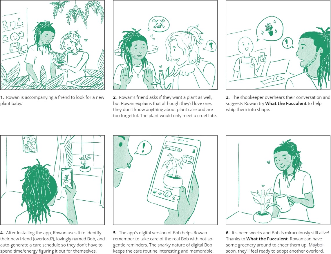
I also drew a storyboard to envision our users' happy path and their emotional journey through it with the app’s not-so-gentle attitude. This way our team could really incorporate the personification and emotional aspect our users needed into our solutions.
- Rowan is accompanying a friend to look for a new plant baby.
- Rowan's friend asks if they want a plant as well, but Rowan explains that although they'd love one, they don't know anything about plant care and are too forgetful. The plant would only meet a cruel fate.
- The shopkeeper overhears their conversation and suggests Rowan try What the Fucculent to help whip them into shape.
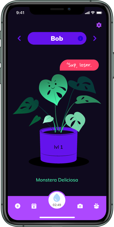
- After installing the app, Rowan uses it to identify their new friend (overlord?), lovingly named Bob, and auto-generate a care schedule so they don't have to spend time/energy figuring it out for themselves.
- The app's digital version of Bob helps Rowan remember to take care of the real Bob with not-so-gentle reminders. The snarky nature of digital Bob keeps the care routine interesting and memorable.
- It's been weeks and Bob is miraculously still alive! Thanks to What the Fucculent, Rowan can have some greenery around to cheer them up. Maybe soon, they'll feel ready to adopt another overlord.
Prototype
Lo-fi sketching
We dove into prototyping by breaking up the user flow into 3 chunks and having each team member sketch out their chunk so we could be more efficient with our time. By working through sketches, giving each other feedback, and iterating the sketches, we were able to quickly explore different solutions to our problem to find the strongest ones. One thing we really wanted to stay throughout our iterations was keeping the digital version of the user's plant front and center for making their real plant more visible.
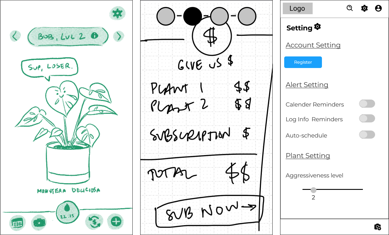
Wireframing
Once all adjustments had been made to the sketches, we needed to combine them into a cohesive set of wireframes to test our ideas with users. I really wanted to take charge of the wireframes for this project to keep developing my skills, so I:
- applied one style to all the screens to minimize any confusion that might crop up from inconsistencies or visual noise.
- added in-between screens for flow clarity.
- fleshed out the snarky copy. It was definitely a challenge for me to make it fun while keeping the meaning clear.
Test and Analyze
Usability testing
To validate the wireframes, we conducted usability tests as a team with 6 users. Since we had two different flows for adding new plants, we asked half the users to start by taking a photo of their plant and the other half to use the app’s suggestions. We also asked them to water Bob when his alarm went off, and buy a subscription and a starter kit.
We found that while users successfully completed all 3 tasks, a few features weren’t clear enough. The team used a matrix based on importance to the users and What the Fucculent to help us prioritize which issues to address in the next iteration.
SUBSCRIPTIONS
- Issue - Users thought subscriptions were for in-app items (like a game)
- Fix - Add explanatory copy to make it clear that subscriptions are for physical material delivery
PLANT PROFILES
- Issue - There was a lot of content to scan through
- Fix - Add key spec icons to the top of the plant info section and use color to make content into more bite-sized chunks
- Issue - Some users didn't realize there was more content below the fold
- Fix - Visually indicate scrollable content with an arrow
PLANT/ROOM SCAN
- Issue - Users weren't sure what the app was scanning for
- Fix - Add explanatory copy for how scanning feature works
Iterate
Making a style guide
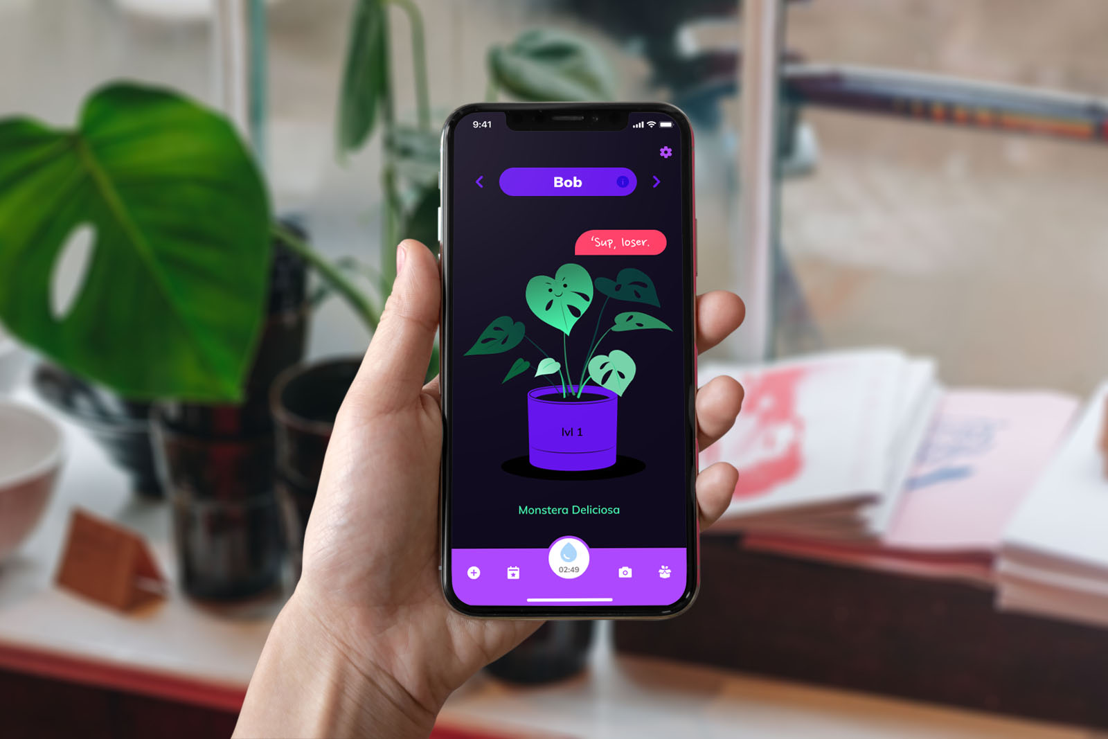
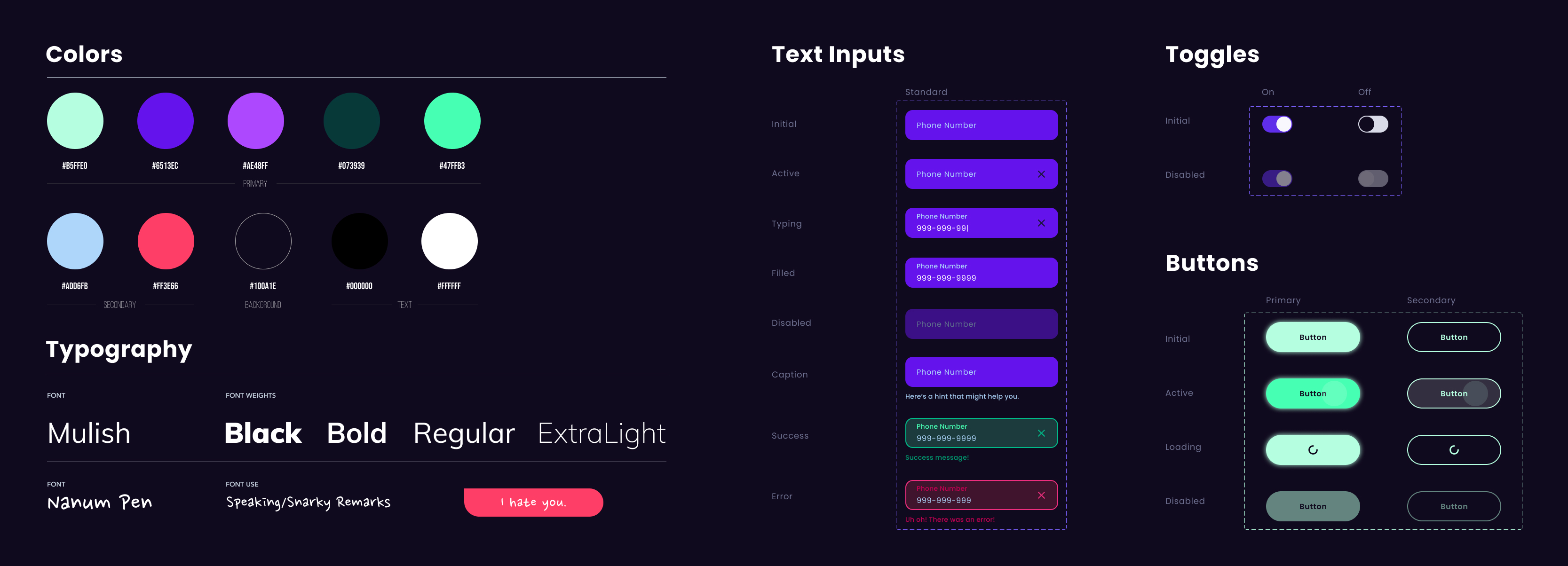
We wanted our next iteration to be a hi-fi prototype to help address some of the issues we had in testing. The use of color would be especially useful for visually breaking up and differentiating information. Because we built the app’s personality around snarky humor, we decided together on a blacklight color theme and rounded corners to match the dark playfulness. My teammate turned the theme into a full style guide to apply to the hi-fi prototype so we could keep the whole look and feel cohesive.
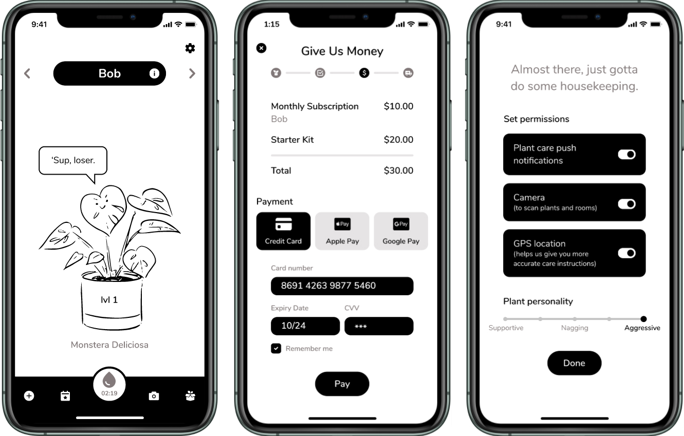
Hi-fi prototyping
We applied the style guide to the wireframes and incorporated feedback from usability testing. Features that were more fleshed out included:
- Add a new plant by scan or suggestion
- Plant profile
- Care calendar
- Care alarms
- Subscriptions
Lessons Learned
FINDING A PROBLEM TO SOLVE
This project was so open-ended that it was more difficult to design in the beginning than starting with specific constraints. The competitor analysis helped us find a gap to target, but it was really lucky that my teammates and I had overlapping experiences and were already empathetic to that user group; it made the discovery process super fun! I know that it's not typical to have this much design freedom outside of student projects, but it's important to always keep user empathy in mind when exploring any problem space.
VIBING WITH OTHERS
I've managed other projects before and navigated through some tough team conflicts during those projects, but What the Fucculent was the first one to go so smoothly! We hit it off great when we were just chatting about possible project directions. It made such an incredible difference when the whole team felt comfortable with frankly communicating, taking feedback, adapting to changes, and sharing the load throughout the process.
COPYWRITING
I had lots of fun adding sassy copy to the app, but realized from user testing that plain language was important to use with novices. I had to be careful to strike the right balance of fun and informative.
What's Next?
If there had been more time, I would have loved to do another round of testing and iterating with the hi-fi. I'd also like to get feedback from a plant expert to better design what users would get out of the subscription plan.

