RESPONSIVE WEB DESIGN
USDA Redesign
TL;DR
The challenge
The US Department of Agriculture (USDA) covers 29 agencies and serves millions of Americans every year. As you can imagine, their existing website is HUGE! The goal of the redesign was to increase the task completion rate and help all the USDA's different users find information successfully and quickly.
GIVEN PROJECT CONSTRAINTS:
- 4-week timeline
- Redesign the USDA website
- Deliverables were hi-fi prototypes of both the mobile and desktop versions of the redesign
My role
Since the website was too big to tackle alone within the timeframe, I worked with 3 other UX Designers to get thorough user research and initial usability testing done quickly. After we pinpointed the problem together, we worked independently for the rest of the project on solutions. For mine, I did the information architecture, UI design, and tons of usability tests along the way.
The solution
Much of this project's design process revolved around prioritizing to find the solution with the most impact on users within the timeframe. I used card sorting and multiple rounds of usability tests as the major tools to achieve this.
Simplifying navigation, and restructuring it around the specific user groups that the USDA serves, allowed users to find the information they needed much more smoothly and efficiently than with the existing site. On average, users:
- saw a 160% increase in task completion.
- took 172 seconds less time to complete their tasks.
User Research
How do we start??
To understand why the USDA website needed a redesign in the first place, my research team and I needed to figure out who the users were, what they needed from the USDA, and how they found that information on the existing website. But even starting that process was seriously overwhelming! The existing site houses hundreds of pages for dozens of topics, programs, agencies, and initiatives. What were we supposed to focus on??
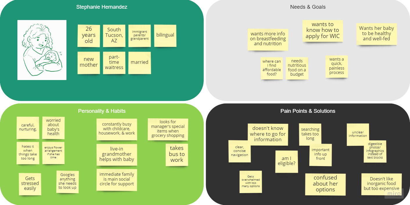
We decided that since the USDA's purpose is to help the average American, we should focus on users looking to apply to one of the USDA's many assistance programs. To help us keep these users in mind while assessing the existing design, we made the proto-persona of a new mother seeking assistance from the Supplemental Nutrition Program for Women, Infants, and Children (What a mouthful! Also widely known as WIC). Stephanie's goals are to:
- Know whether or not she's eligible for support
- Understand the program's benefits and what to expect from the application process
- Apply to WIC quickly and easily
Mapping the user path
Part of understanding what to redesign came from knowing what links and pages users interacted with to get to their destinations. We figured this out by mapping the possible paths Stephanie could take to get from the USDA homepage to the WIC application page. The shortest paths she could take were:
- 5 different pages to apply to WIC by phone
- 7 different pages (including one external) to apply online
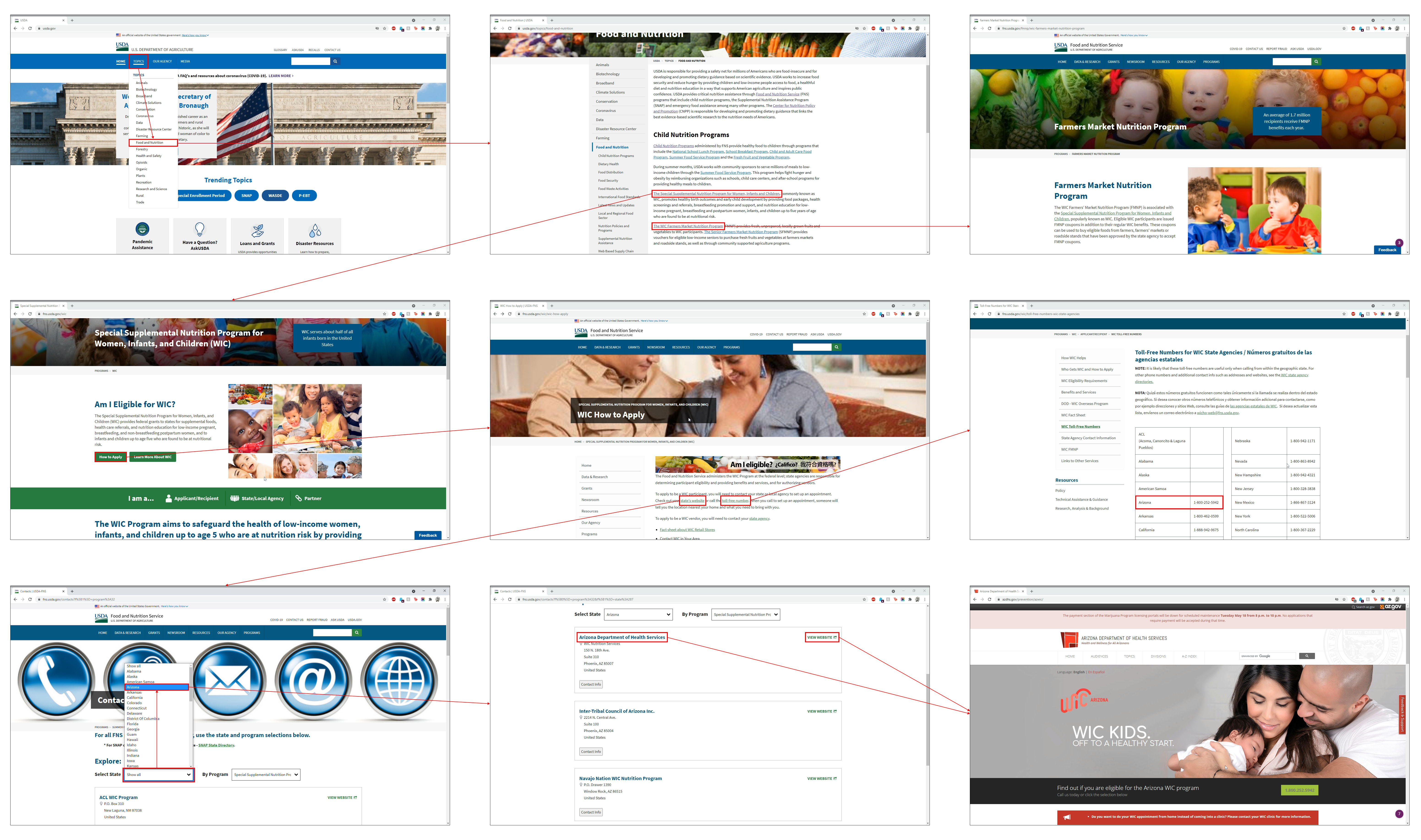
That's a lot to navigate! Extra WIC information was also located on separate pages from the main user path (for example, another link besides the one for WIC nested under "Child Nutrition Programs" led to information on the WIC Farmers' Market Nutrition Program on a standalone page).
How bad is it really?
Now that we knew which pages users would face, we needed to see what usability issues they ran into on those pages. We started by conducting a heuristics analysis to mark the problems that we saw as designers.
MAJOR ISSUES:
- No clear hierarchy of information to direct users
- Pertinent navigation was nested in blocks of text and hard to find
- Information was too spread out across multiple user paths
We wanted to validate our analysis and also see just how intuitive the existing site was for users and if they got stuck. To do this, we conducted usability tests of the existing site with 5 participants and watched as they navigated from the homepage to the WIC application page (either for phone or online). It turned out that there was a lot of overlap in our observations. In addition to the issues from our heuristics analysis (that were validated through this testing), we also found that users ran into:
- inconsistent breadcrumbs which led to backtracking
- a lack of accessibility from the erratic navigation
- very slow task completion from low scannability
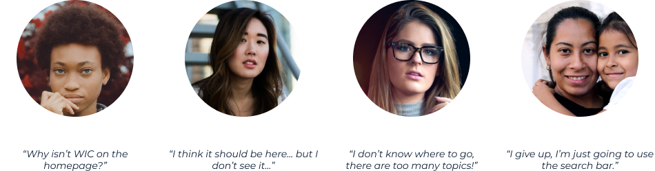
Two users were so frustrated that they totally gave up on typical navigation and resorted to using the search bar. That's pretty bad. All of our users expected the program application and relevant information to be accessible up-front.
Prioritizing what to solve
There were many specific points that came up during testing that would have been helpful to address in the redesign, but since we only had 4 weeks total to do it we had to prioritize the most major issue to focus on. We used a matrix based on importance to users and importance to the USDA to organize our testing notes and found that navigation was the biggest factor in task completion. Surprise, surprise.
Information Architecture
IA and reorganizing
At this point, the research team split up to work on individual redesigns. Since we found that confusing and inflated navigation was preventing users from finding information quickly and easily, I wanted to restructure the navigation so that it would guide the user's path more intuitively. To do this, I conducted a card sort of the existing sitemap with the goal of condensing pages. It turned out to be a STRUGGLE because of the site's ginormous size and how many different ways it could be organized depending on if I sorted hierarchy by agencies, programs, or topics.
From testing, we saw that users tended to navigate by first scanning the page content for anything pointing to WIC or program applications. When they couldn't find that, they used the main menu to look for the topic they thought WIC should fall under. Because of these observations, I decided to condense the menu navigation by organizing it into the four main categories of USDA support that I naturally discovered during the card sort:
- Agriculture and Industry
- Health and Nutrition
- Natural Resources
- Rural Development
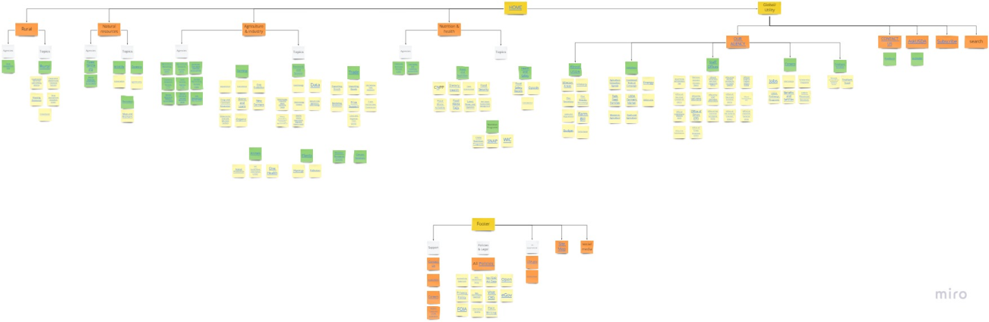
A new sitemap
Now the user path from homepage to WIC application was cut from 5-7 steps down to only 3. With the navigation restructured, I wanted to get it validated by users. Before I could make wireframes to test though, I needed to plan them out by turning the card sort into a new sitemap.
PRIMARY LINKS
- Agriculture and Industry
- Health and Nutrition
- Natural Resources
- Rural Development
SECONDARY LINKS
- Agencies
- Topics (including any programs)
GLOBAL/UTILITY
- Our Department
- Contact Us
- Ask USDA
- Subscribe
- Social Media
- Search
FOOTER
- Support
- Policies
- US government
- Sitemap
- Social media

I also wanted to improve the site's accessibility and help more people by adding toggles for other languages, high contrast, and large font size to the global navigation.
Wireframe
Designing the main menu
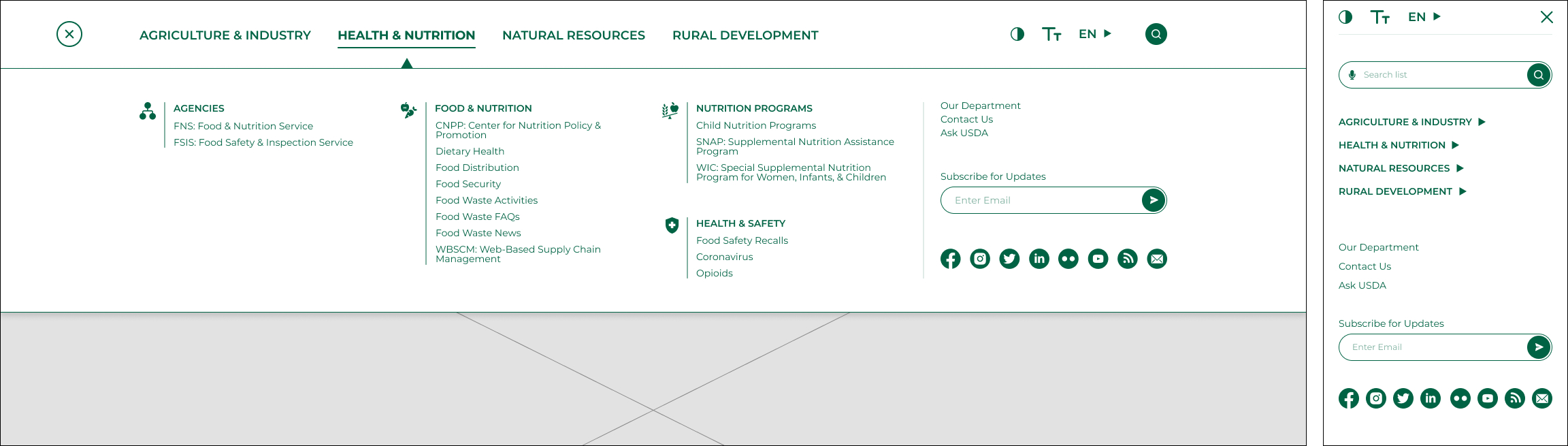
Since user research proved that navigation was the most crucial part to address with the redesign, I focused first on designing the main menu for both desktop and mobile viewports using the sitemap I made. The new sitemap was still very dense though (there was only so much condensing I could do), so I referenced e-commerce sites with large product lists and how they visually organized their menus. My proposed solution also included:
- icons in the desktop version for menu scannability
- enough breathing room for legibility
- consistent visual treatment to help emphasize information hierarchy
Designing page content
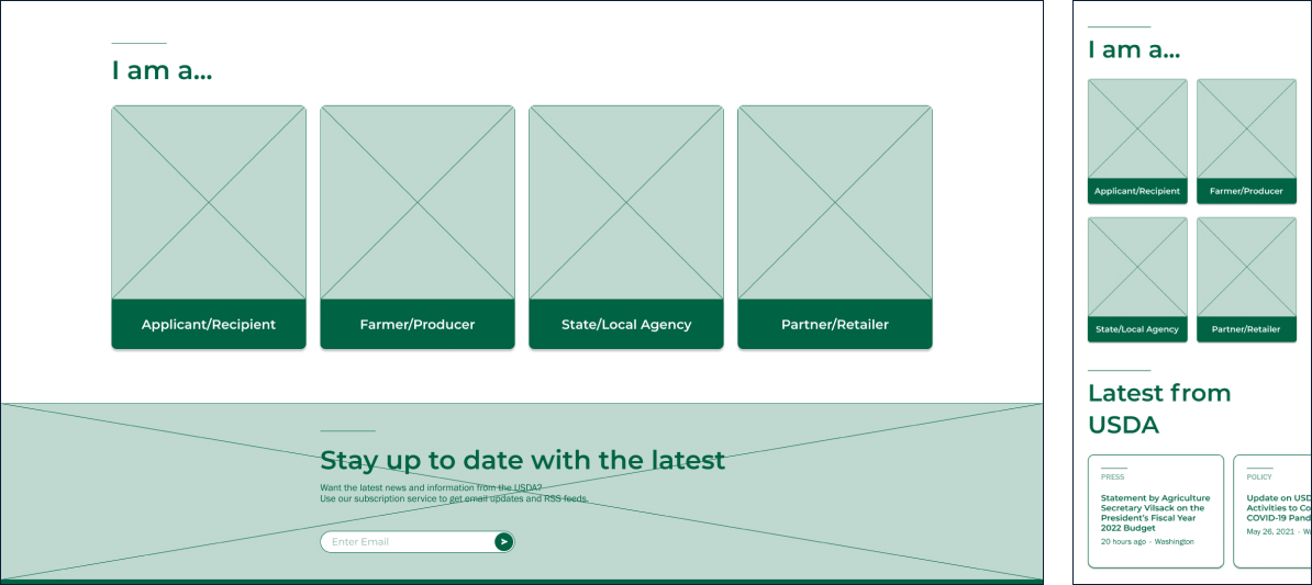
I also needed to design the rest of the page content, but how? I went back to thinking about our users and how they wanted information up-front during testing. As it is, the homepage shows what the USDA has accomplished rather than what services it can provide for the user. If users were having trouble knowing where to go, why not focus on guiding them? I decided to prioritize page content around directing the user groups.
To do this, however, I needed to find out who the other user groups were - those aside from our primary group of program applicants. I went back to my card sort and found that four groups were consistently targeted by the USDA's various programs and initiatives:
- Program Applicants and Recipients
- Farmers and Producers
- State and Local Agencies
- Partners and Retailers
I turned the user groups into cards to serve as the main page content for the USDA homepage and WIC homepage. I also used cards to organize application information on the WIC application page. This way, users could see relevant information in one click instead of searching through blocks of text.
Test and Analyze
Usability testing again
To validate my solutions and get feedback for another iteration, I conducted 6 usability tests and asked users to navigate to the WIC application page from the main USDA homepage in the wireframes. Key findings from testing were:
TASK COMPLETION
- No issues - All users completed their task and overall were able to do so easily
DESKTOP MENU
- Issue - Letting was too tight between the lines to scan well
- Fix - Line spacing was increased to improve menu legibility
MOBILE MENU
- Issue - Text was somewhat hard to parse due to its font size and density
- Fix - Font size and line spacing were increased to improve menu legibility. I also added in the desktop version’s icons to help differentiate categories further.
Iterate
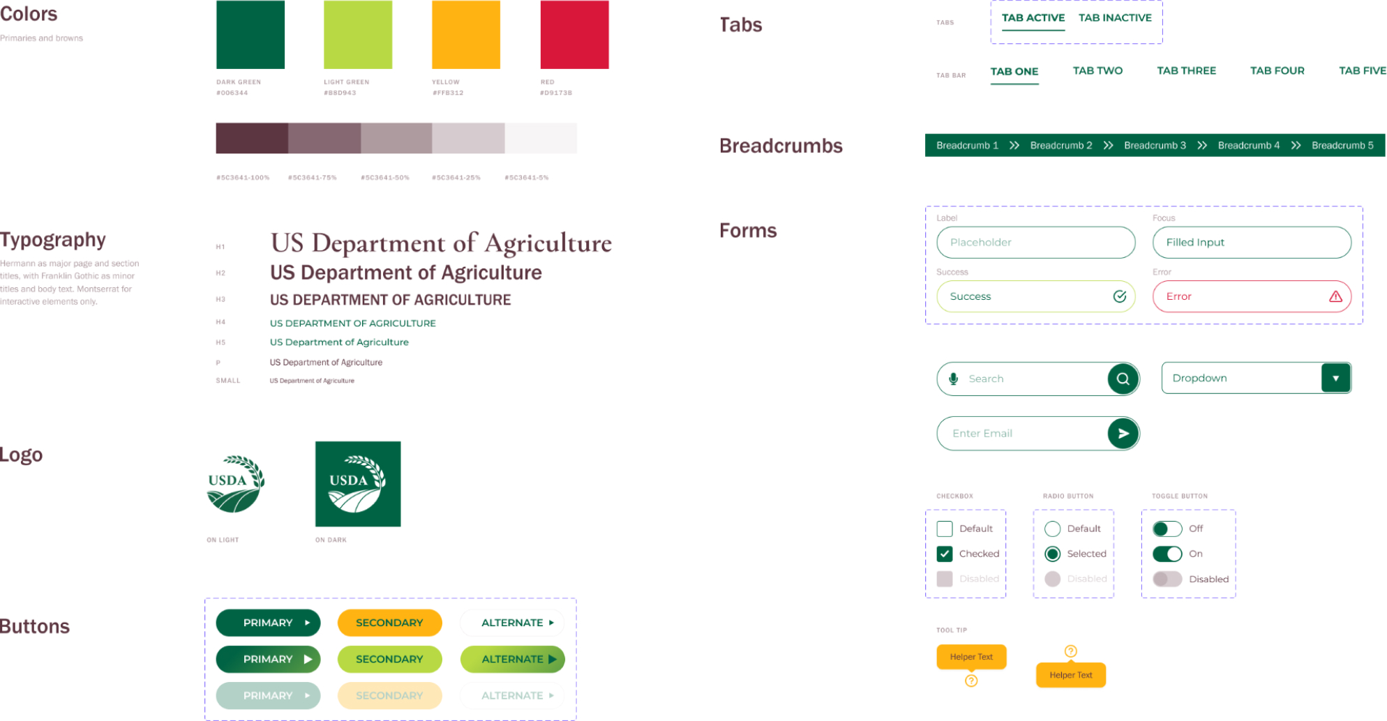
Making a style guide
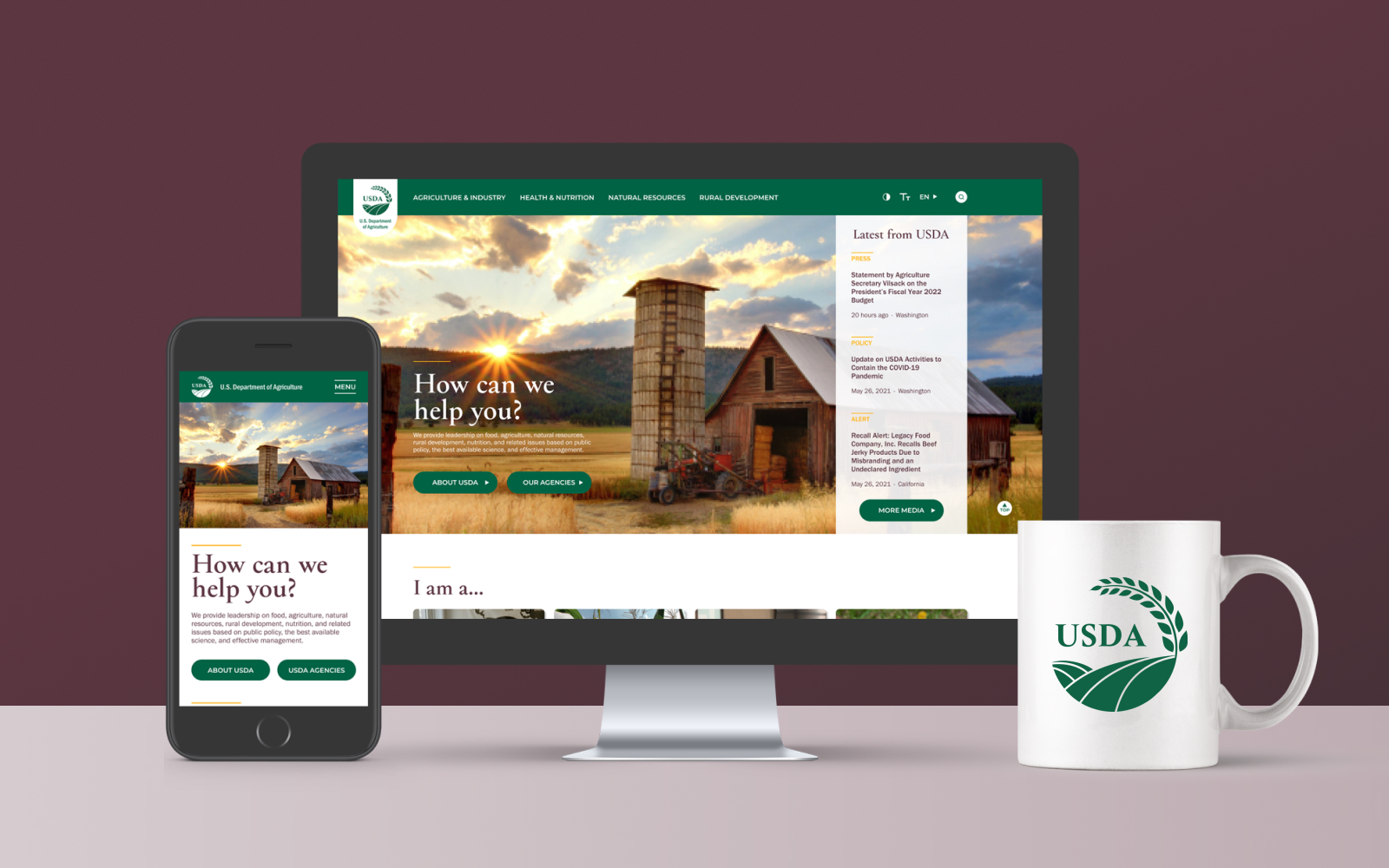
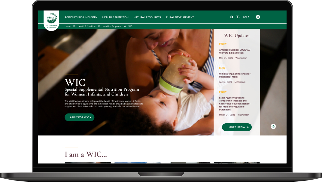
After I made the menus more legible, I wanted to get even more detailed feedback with a hi-fi prototype. By adding color, images, and a more polished look to the prototype, I could more closely simulate how users would feel if the redesign were a real website. I learned from working on ClimbZen how important consistency was in keeping users from getting distracted by visual noise, so I made myself a style guide to keep the whole hi-fi prototype cohesive and aesthetically pleasing before putting it together.
The website still needed to feel approachable and trustworthy to the average American, so I emphasized natural colors and lifestyle photos as opposed to illustrations. I also created an updated logo to match and made sure the primary colors would pass both AA and AAA standards.
Hi-fi prototyping
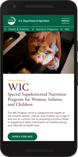
I put all the previous pieces together for the hi-fi designs of the:
- USDA homepage
- WIC homepage
- WIC application page
Even more usability testing
I conducted 10 more usability tests with new participants to validate my hi-fi solution. At this point, I realized I don't actually have that many friends (womp womp), so it was getting hard to find friends of friends or family to ask for feedback. Luckily, I'm not that shy about talking to sort-of-strangers and those kind souls came through for me! Those users continued to complete the task of navigating from USDA homepage to WIC application page quickly and easily, with minor occasions of confusion:
- Hover - Some users expected the desktop main menu to appear on hover rather than click
- User path - Two users wanted to find the WIC program by first looking at all USDA agencies, which wasn't built out in the prototype
- Content - Two other users didn't realize there was more content below the fold
- Navigation - There was an interesting divide between users who completely ignored the main menu, and those who ignored the page content
Lessons Learned
PRIORITIZATION
I was honestly kind of scared to tackle this project in the beginning because of how overwhelmingly huge the USDA website is. I had to constantly think about what the users needed out of the site to help me prioritize where my efforts went. For example, as part of making the redesign more accessible, I added toggle options for high contrast, font size, and language in the main menu. As much as I wanted to implement those toggles in the prototype, however, they just weren't needed for achieving the project's goal within the timeframe. I would love to have fleshed out that portion if I had more time though!
USABILITY TESTING
I already knew this, but this project really emphasized to me how important usability testing is at all stages to help validate design assumptions. I also learned it's hard to find enough testers unless I step a little outside of my comfort zone.
IA
This project was my first time really getting into IA, and the card sort was a big struggle for me. I spent a long time organizing it in different ways over and over before I found one that made sense to me. I learned a lot from the process and I think the next time will be much smoother.
What's Next?
I received many comments over the course of testing about wanting a WIC program button visibly placed on the homepage to make navigation even faster. However, since the USDA covers many more topics and programs than just WIC, it didn’t make sense to put so much weight on just one program. Since this was a student project, I wasn't actually in contact with anyone at the USDA. If I had more time, I would have loved to show them the prototype and ask what their current traffic is like: Is WIC as popular as it seems to be, and does it make sense to give it its own homepage button? I’m also very curious to see how they'd think of it as the stakeholder.

